
| Customer View
Project Overview
Within the Fiverr organization, Fiverr has a back-office that team members at Fiverr use. The Customer View is a snapshot of a user’s account.


1
The Customer View story
The Customer View is the most-used page in Fiverr’s back-office. It has been in use since the wee beginnings of the company, and over time became a mash-up of design languages and conventions. It was designed on-the-fly by whichever team needed a given feature, from customer support to the security team. After promptly holding a bat-mitzvah for this legacy page that has served us so well, it was decided that an update was due. It’s makeover time!
understanding the problem
The Customer View had become a mess of code and UI. The user experience was frustrating, and it took 8-18 seconds to load. Data was scattered both visually and technically, and was hard to make sense of. The Customer View is used by 300+ team members on a daily basis at Fiverr. This load-time translates to hundreds of work minutes spent looking at a loading screen. I know it’s probably hard for you to read that (and I’m sorry, but this was real life I’m not making it up).
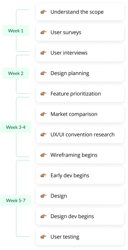
The first thing we (My PM and I) did was create and established among the stakeholders a process that looked something like this:
2
User interviews
I conducted 15+ interviews with major stakeholders within Fiverr, including the Head of Customer Support, The Fraud Department, Marketing Integrity and more.
There were two main aspects of the interviews. One aspect was to understand better which components were most needed by a given team and to prioritize those components (more quantitative). The second aspect was more qualitative. I wanted to understand how the interviewees felt during different stages of using the Customer View. A few common themes came up during the interviews:
58%
of users voiced a need for a quick overview of the last few events of a certain kind so that they can get a clearer picture of what the user’s experience has been.
82%
of users said it was difficult for them to understand how to navigate the Customer View, made more difficult in the context of often time-sensitive tasks.
65%
of users were frustrated by the amount of tabs that external links in the Customer View opened. It was hard to keep track of and maneuver between information.
94%
of users felt overwhelmed by the amount of information displayed in the Customer View. At most, they needed half of the information to be visible immediately. Certainly not all of it.
In addition to insights gleaned from users of the Customer View, the development team also had needs relating to the development of the Customer View, which was the first page in the back-office to be redesigned. Future redesigns of other pages would use the same design language and design system. It was important for the development team to have defined components, along with rules that define when and how to use each type of component.
3
Feature-specific research
A design system was needed so that the dev team responsible for the back-office did not have to have a designer—they could function and iterate entirely on their own without designers.
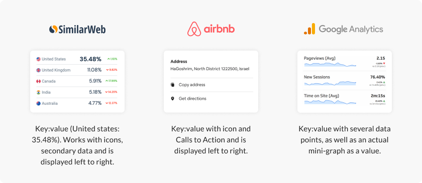
I wanted the design system and component guidelines to be very well informed, so I started researching how certain features behave and look in other products, mainly e-commerce products. Feature-specific research differs from general market research in that with feature research, I am looking at something small such as how a key:value or how a price is displayed, and not an entire flow.
key-value pairs
Here is a small taste of some of the feature-specific research: Key-value components. In their nature they have to be extremely flexible and work well with any other type of content.
4
Redesigning the Customer View
As much as the design of the page played an important role, the design system/component library played at least an equal part. Let’s check out the design, and then we can check out some of the components from the new back-office design system.
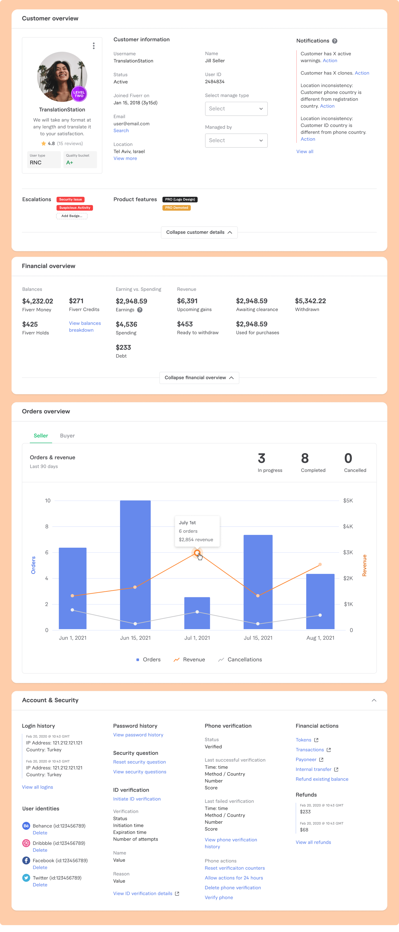
These sections are example sections, and there are more like them that use the back-office design system. The sections are constantly changing and being updated. It’s a very living organism made of cells that are the components. Let’s take a look at the building blocks of this mini-verse (the components)!
5
The new back-office design system & guidelines
At the heart of this project there is a need by all departments for flexibility and modularity. That is a virtue that was baked into every single one of the components. Each component should be able to be placed in the context of other components and in the same grid, and still work well.
pop-ups in customer view
One of the pains we learned about was that users were pained by having so many tabs open—due to the old Customer View sending that user somewhere else each time it had the inability to show a certain kind of information. Pop-ups are a great middle-ground that provide more information on-the-fly, without forcing the users to lose (or change) context.


permissions
Since managers at Fiverr and non-managers do not need to see the same content, and since some content is semi-sensitive, we created a dynamic permissions system. Permissions needed to be adjustable on the section, area or component level.
Collapsible content
Another pain point we learned about is just having to visually sift through lots of information. We reassessed each data point’s priority and designed an expander/collapser to minimize the information and thus the congnitive load.


6
Observations and takeaways
As soon as we sent out the first prototype of the redesign, we received feedback immediately and mapped it out. Overall though, on the component level Fiverr team members felt relieved to see a redesigned and re-thought out experience. Each team has specific needs so we tailored the sections respectively as much as we could for them. This is for sure a work that is still in progress and evolving.
Thank you for reading!